brand guidelines
Welcome to our brand guidelines, a digital tool we’ve created to help make it a little easier for you to maintain our brand.
Here you'll find the foundational elements that create our Arbor brand identity. Consistency is key in keeping our brand presence strong. Consistent and repetitive usage of these elements will create lasting recognition and a memorable connection with our audience.
concept
Our brand concept reflects on everything from our logo to our color palette and typography. We often refer back to this strategy when making brand decisions.
mantra
Our brand mantra is not advertising copy or a tagline, and, in most cases, it won’t be something we use publicly at all. This is who we are, our brand essence and our brand promise.
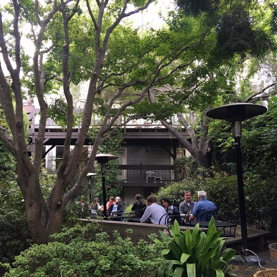
We believe quality food, friendly service, and a vibrant atmosphere should be available to everyone. Located in the heart of Hayes Valley, we’re the quintessential destination for our local community either here or on-the-go. With a variety of fast healthy food, beer and wine on tap, or a bottle from our connected wine shop, it’s your choice. We let people curate their own experience at Arbor—sit outside in our casual garden patio or enjoy a variety of indoor options for yourself or with friends. We believe people deserve good food + good service.
personality
Our personality is an important part of our brand because, like human personality, it is both differentiating and enduring. Our brand personality directs the voice, tone and style through which we communicate.
quality
service
casual
healthy
comfortable
inclusive
vibrant
friendly
simple
curated
approachable
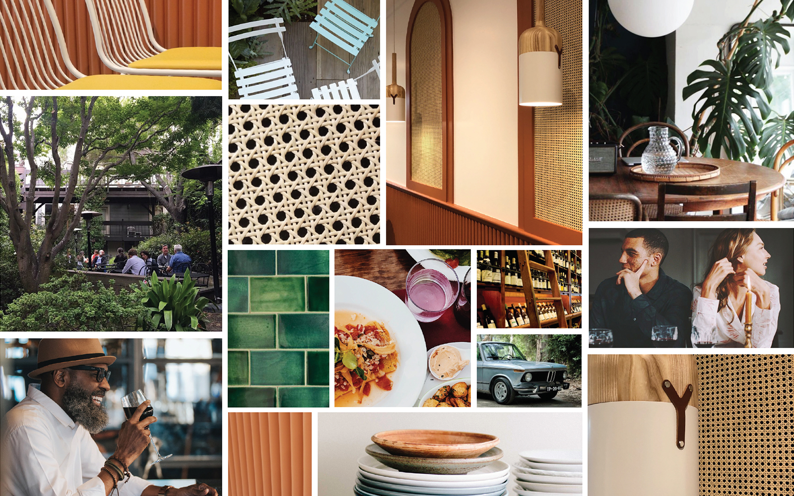
visual attitude
This visual brand attitude is a summation of our mantra and personality. Like the mantra, it is for internal use and evokes the attitude we want people to feel when associating with our brand. Many of our personality words can be found in this mood board, from casual and comfortable, friendly and approachable, to inclusive and vibrant.
logo
Our logo is the most important representation of the Arbor brand and may be used in two formats.
primary logos
Our master logo contains the full Arbor name and the logo symbol contains our 'A' emblem.


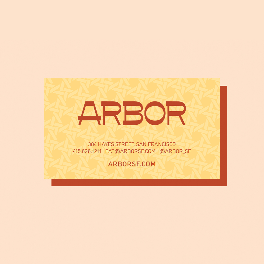
master logo
As often as possible, our master logo should be used in our primary terracotta brand color over our yellow background color. This may be reversed when appropriate. Black and white logos are used when color is not applicable.


logo mark
There are instances where the 'A' logo symbol may be used on its own. Careful consideration should be taken when using the symbol instead of the master logo. To help decide, ask yourself: Will my audience know the 'A' stands for Arbor? Is the written name “Arbor” in close enough proximity for reference? The symbol may be used for social media profile avatars, internal branded schwag, and on-location branded collateral.


CORRECT LOGO USAGE
- Our logo should be used as often as possible with our primary terracotta and yellow brand colors.
- The yellow logo is used on the terracotta background color only.
- The terracotta logo should be used on natural paper stock, whether uncoated or recycled.
- The logo may be used over the screened back brand pattern for a subtle textural feel in select applications.
INCORRECT LOGO USAGE
- Do not use our logo over any color other than our primary yellow and terracotta brand colors.
- Do not use our logo over a secondary brand color
- To avoid repetition, do not use our logo and logo mark in close proximity to one another
- Though permitted for occasional digital applications, try not to use our logo often over photography.


color
Our brand color palette reflects friendly warmth and creates a seamless experience with our interior design.
primary colors
Terracotta and Yellow are our primary brand colors. Terracotta is used for the logo and headlines while Yellow is used as a background fill.
SECONDaRY COLoRS
Green and Cream are our secondary brand colors. Green is used sparingly for pops of color to attract users to a CTA or enticement amongst the primary brand colors. Cream is used to add warmth to backgrounds and to provide breaks to the yellow background color where needed.
COLoR USaGE RATiO
This ratio shows how much you should use each of our brand colors. Terracotta and Yellow are used most often, whereas Green and Cream are used less often.
typography
‘DINosaur’ is our brand font and should be used as often as possible. This font is clean and modern, while friendly and approachable. Subtle soft edges give the font a slight humanist warmth. We use the Light, Book, and Medium font weights only. Avoid using the font too big and too bold.
primary font
display headline.
Sentence Case.
Paragraph text, gravida mi nibh, a auctor enim tempor non. Sed non ultrices neque. Nunc lectus lorem, condimentum vitae sem sit amet, lobortis ullamcorper nisi. Nam odio lorem, varius vel lacus id, ullamcorper suscipit arcu. Praesent vel diam nec augue porttitor molestie. Nam sed justo ac est sodales hendrerit quis nec eros. Mauris non massa vitae nunc tincidunt egestas. Vivamus enim nulla, pellentesque id pharetra sed, lacinia at nulla. Maecenas nec suscipit libero. Nunc tempor nulla eu urna tempor, ut pharetra nulla pretium.
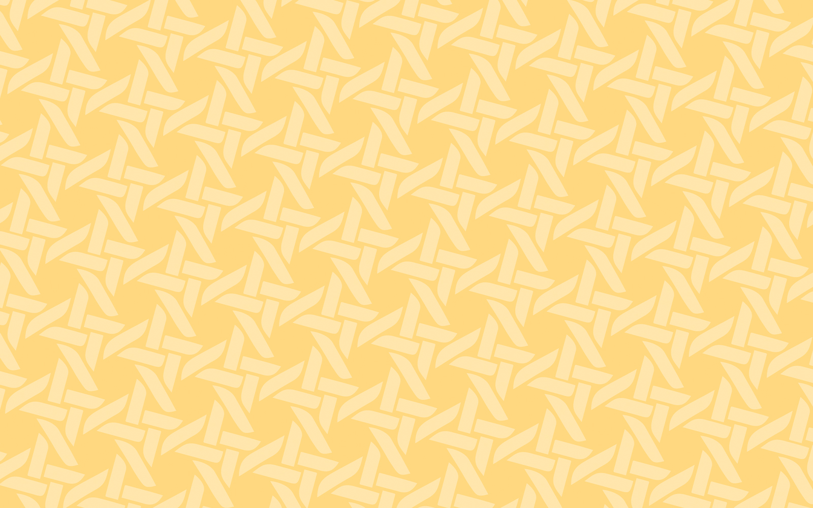
illustration
Created with the same shapes from the letterforms of our logo, our brand pattern adds a hint of textural warmth when needed. The pattern emulates the wicker caning found inside Arbor, bringing a familiar interior element to our printed and digital collateral.

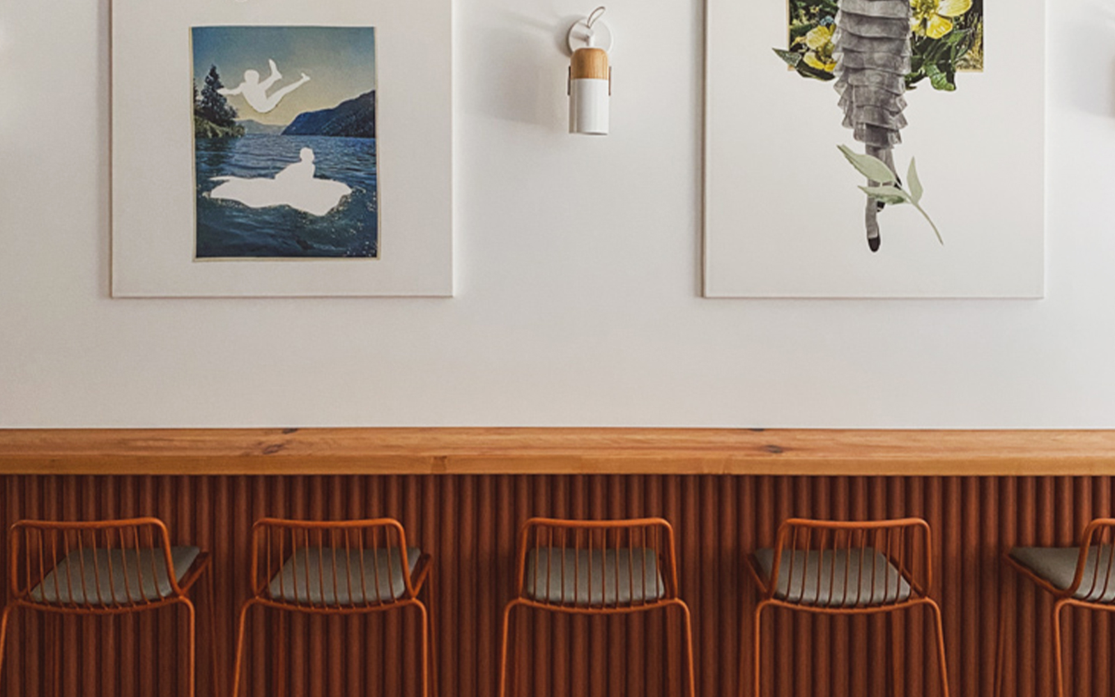
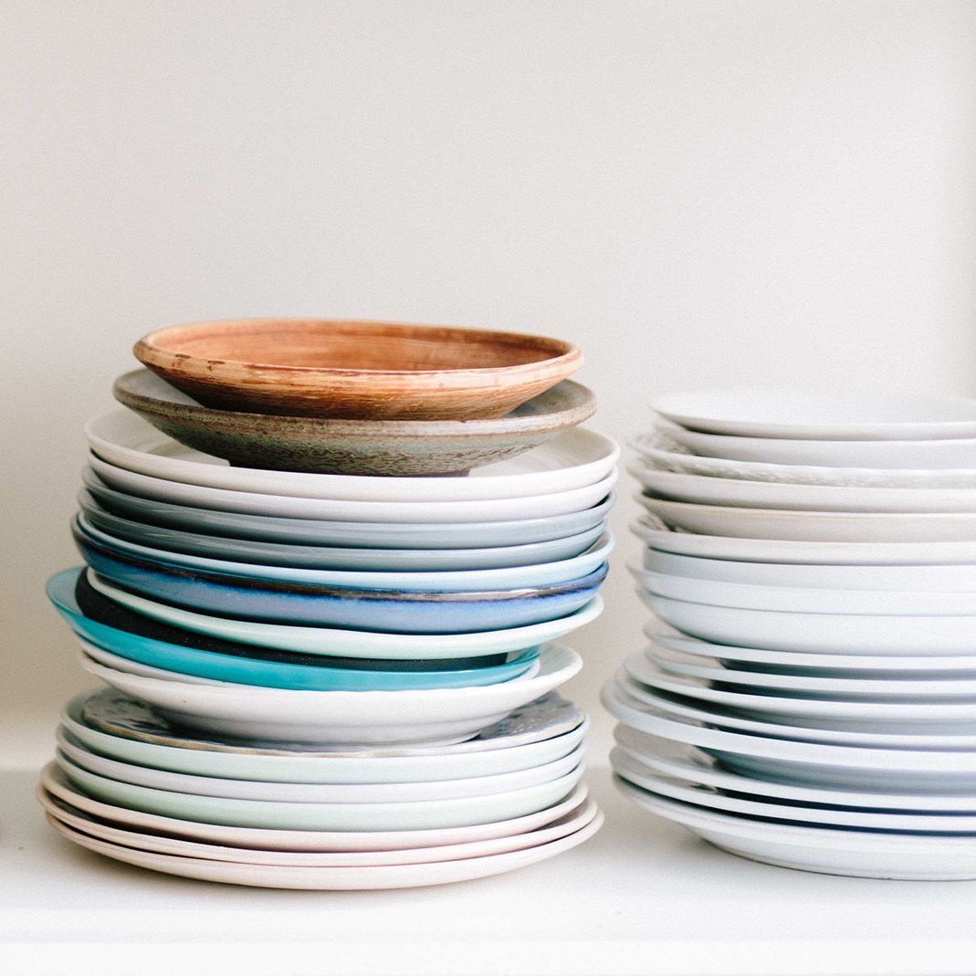
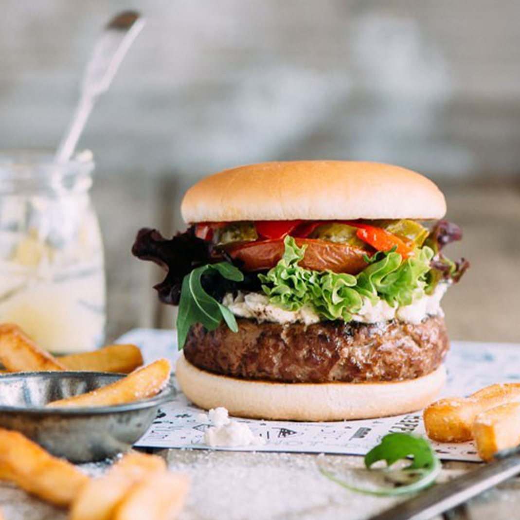
photography
Our photography should always align with our brand personality. All photos should be: simple & curated, casual & comfortable, approachable & friendly.
photography art direction